Web & Product Designer — 9+ Years

I design the interface, then automate what happens after someone clicks it.

I build client-facing platforms, brand websites, and AI-powered workflow systems — currently designing voice AI products and client sites at Rievax IT Solutions. Background spans UX/UI design, front-end development, and workflow automation.

Based in Burlington, ON Focus UX/UI Design · Web Design · AI Automation Status Actively interviewing

Selected work

Live, shipped projects

01 / AUTOMATION

Rievax AI

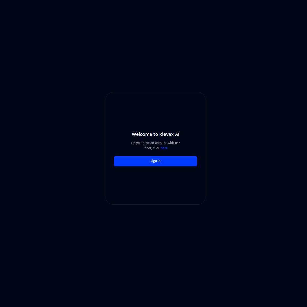
A voice AI platform that handles call routing, receptionist duties, and billing collection for small and mid-sized businesses — designed to sound less like a bot and more like the front desk.

View live → app.rievax.ai
← Back to work
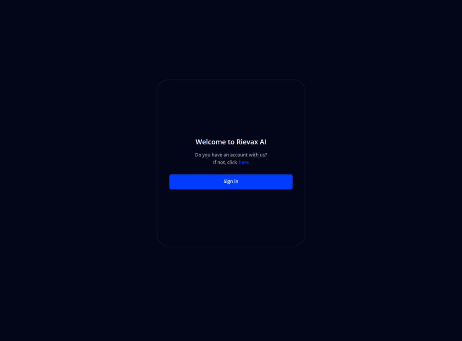
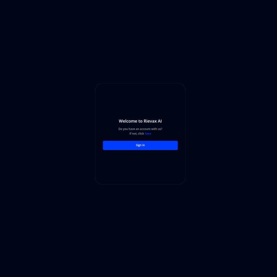
app.rievax.ai
Rievax AI platform screenshot
Live preview didn't load — view app.rievax.ai directly
Live screenshot — pulled directly from app.rievax.ai

Additional screens

www.rievax.ai
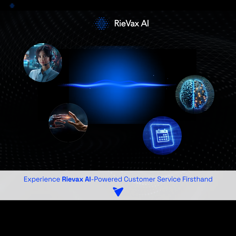
Rievax marketing site screenshot
Live preview didn't load — view directly
Marketing site — www.rievax.ai
app.rievax.ai — full scroll
Rievax app full page screenshot
Live preview didn't load — view directly
Full-page scroll — app.rievax.ai
ROLEAI & Web Developer
COMPANYRievax IT Solutions
TIMELINEFeb 2025 – Present
STACKLLMs, Twilio, n8n, Figma
01 Context

Small and mid-sized business clients were losing revenue in two specific, unglamorous places: missed calls that never got a callback, and overdue accounts that nobody had time to chase down consistently.

Both problems were repetitive enough to automate, but sensitive enough that a bad bot experience would cost more in trust than it saved in labor.

02 Problem & constraints

The brief wasn't "add a chatbot" — it was to design something that could actually stand in for a receptionist or a collections rep without customers feeling handled by a machine.

  • Call-routing and receptionist flows needed to handle real ambiguity — customers don't phrase requests the way a decision tree expects.
  • Billing collection is a trust-sensitive conversation; getting the tone wrong risks the client relationship, not just the call.
  • Every client had a different intake process, so the system had to be configurable, not one-size-fits-all.
03 Process

I designed the conversation flows the way I'd design any interface — mapping the real paths a caller takes, not just the happy path, then working with engineering to wire that logic into the LLM and Twilio integration.

For the collections agent specifically, I designed the decisioning around intent and risk signals in the conversation itself, so the agent could propose a custom payment plan in real time rather than following a rigid script regardless of what the customer actually said.

Alongside the conversational product, I designed the visual and brand layer for the platform itself — the interface clients and their customers actually see and configure.

04 Key decisions
Designed for graceful hand-off, not just automation
Why — a voice agent that can't recognize when it's out of its depth erodes trust faster than a slow human response — knowing when to escalate was as important as the automation itself.
Risk-and-intent-based decisioning over a fixed script
Why — collections conversations vary too much for a script to hold up — reading intent in real time let the agent propose payment plans that actually fit the customer's situation.
Configurable per-client intake, not a single fixed flow
Why — every client's front desk works differently — a rigid flow would have meant re-engineering the product for every new client instead of configuring it.
05 Outcome
70%reduction in client operational overhead
20+automated workflows built into the broader system

The collection agent's real-time risk-and-intent decisioning became the reference pattern for how later conversation flows on the platform were designed.
02 / TRUST

Seaport Group

Canada's leading intermodal transportation company needed a site that made a 50-year safety record, a 400-plus vehicle fleet, and two cross-border terminals feel as trustworthy online as they are on the ground.

View live → seaportgrp.com
← Back to work
seaportgrp.com
Seaport Group website screenshot
Live preview didn't load — view seaportgrp.com directly
Live screenshot — pulled directly from seaportgrp.com

Additional screens

seaportgrp.com/services
Seaport Group services page screenshot
Live preview didn't load — view directly
Services — seaportgrp.com/services
seaportgrp.com/tracking
Seaport Group tracking page screenshot
Live preview didn't load — view directly
Tracker — seaportgrp.com/tracking
ROLEWeb & UX/UI Designer
CLIENTSeaport Group
INDUSTRYIntermodal logistics & trucking
STACKWordPress, Elementor
01 Context

Seaport operates terminals and container yards across Toronto and Montreal, running hundreds of trucks and cranes and handling over 10,000 TEUs — the kind of operation whose scale and reliability needed to be immediately legible to a shipper evaluating them for the first time.

02 Problem & constraints

Logistics buyers make decisions on trust and capacity signals — safety record, fleet size, terminal capabilities — and needed to find them fast, alongside practical tools like getting a quote or tracking a shipment.

  • The site had to serve very different visitors in one structure: prospective shippers evaluating capacity, existing customers tracking freight, and candidates checking careers.
  • As a client-managed WordPress build, the design had to stay maintainable by a non-technical team after launch, not just look good at handoff.
  • On-page SEO — headings, meta data, schema, clean URLs — had to be built in from the start, not bolted on after.
03 Process

I structured the information architecture around the decision a shipper actually makes — company credibility first (safety, scale, locations), then services, then the practical tools (quote request, tracker) — rather than an org-chart version of the company's departments.

Trust signals that read as abstract claims elsewhere — "reliable," "safe" — were designed as concrete numbers instead: fleet counts, terminal capacity, kilometres travelled, elite safety status with their insurer. Specific numbers hold up better under a buyer's scrutiny than adjectives do.

Built on WordPress and Elementor so Seaport's own team could update service pages and locations without needing a developer for every change, with performance work — image compression, caching, lazy loading — layered in so the added visual weight of a trust-heavy site didn't cost load time.

04 Key decisions
Led with concrete numbers over trust adjectives
Why — "Canada's safest intermodal company" is a claim; "125 door trucks, 400 chassis, elite status with Northbridge Insurance" is evidence — B2B logistics buyers are evaluating capacity, not vibes.
Put the quote request and tracker in persistent top-level navigation
Why — these are the two actions a ready-to-act visitor takes — burying them in a sub-menu would cost conversions from the people already closest to booking.
Built for client self-maintenance from day one
Why — a beautiful site that requires a developer for every location or service update becomes stale — designing for the client's actual editing workflow keeps it current.
05 Outcome
35%avg. revenue increase across client site launches, incl. this one

Live at seaportgrp.com today, with the client team maintaining service and location pages independently since launch.

03 / CLARITY

Travelpath

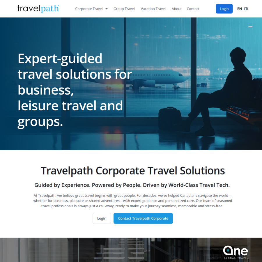
One Canadian travel brand, two audiences with almost nothing in common — corporate travel managers booking policy-compliant trips, and individuals planning a vacation.

View live → travelpath.com
← Back to work
travelpath.com
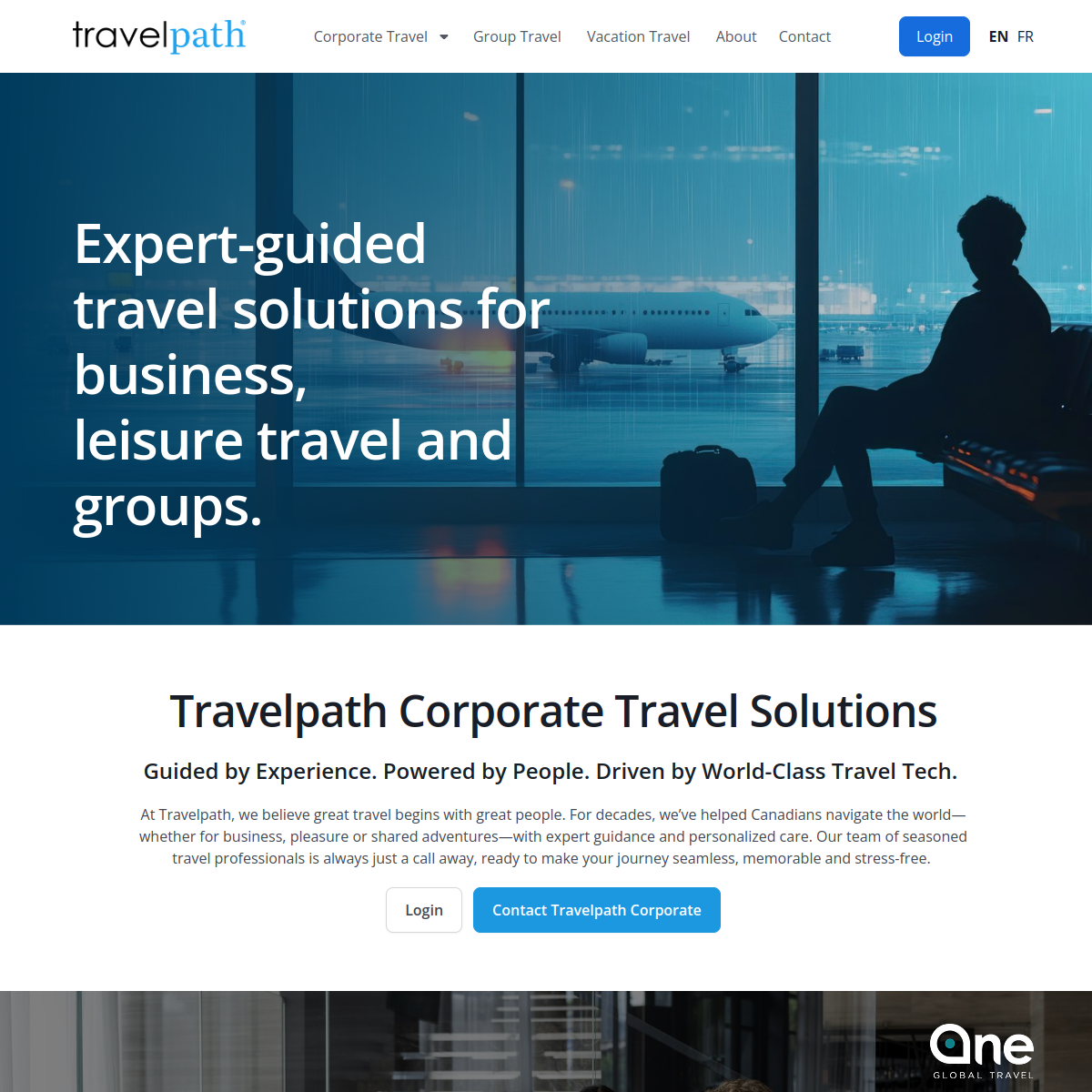
Travelpath website screenshot
Live preview didn't load — view travelpath.com directly
Live screenshot — pulled directly from travelpath.com

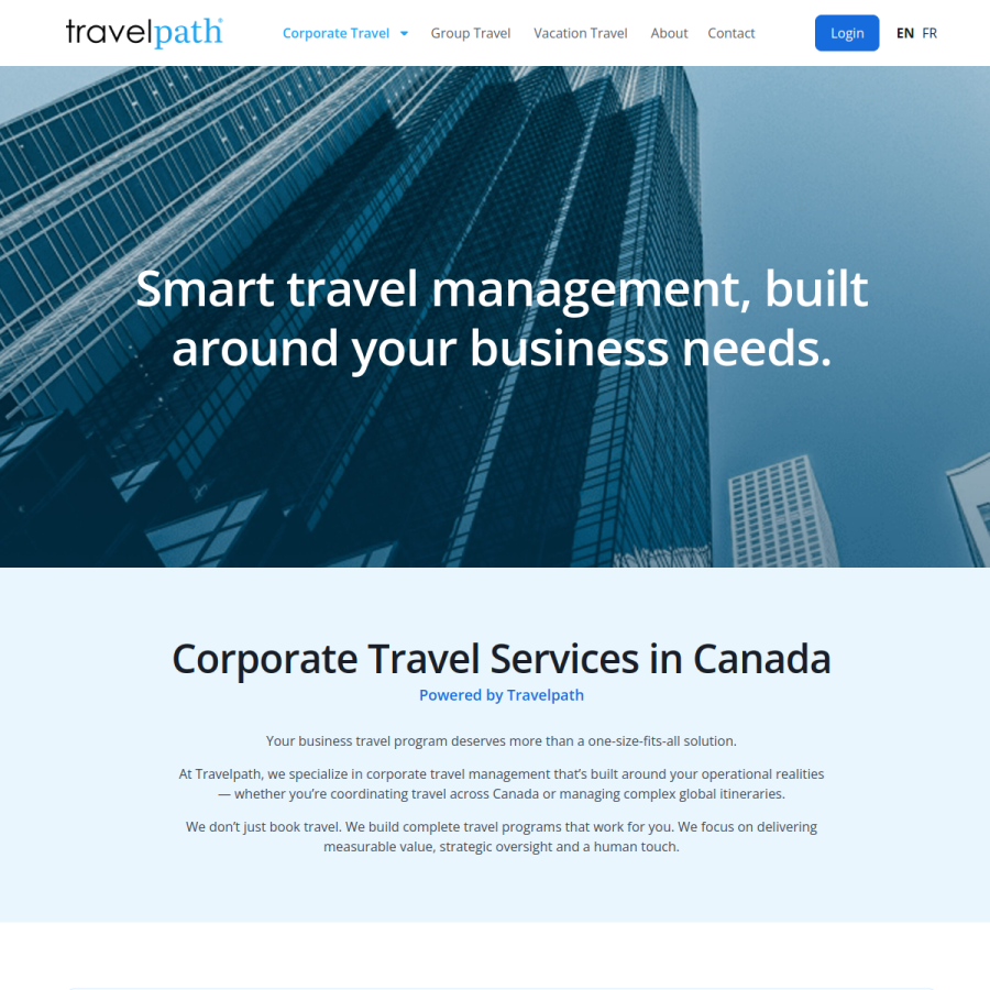
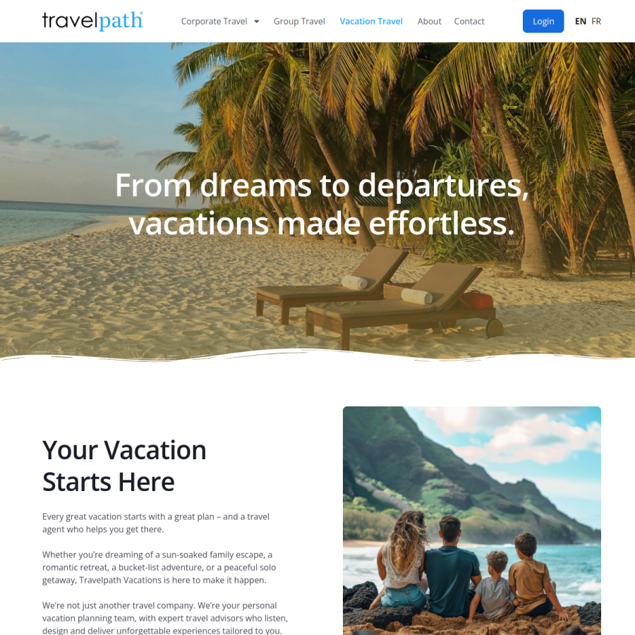
Additional screens — the audience fork in practice

travelpath.com/corporate-travel
Travelpath corporate travel page screenshot
Live preview didn't load — view directly
Corporate track — travelpath.com/corporate-travel
travelpath.com/vacation-travel
Travelpath vacation travel page screenshot
Live preview didn't load — view directly
Vacation track — travelpath.com/vacation-travel
ROLEWeb & UX/UI Designer
CLIENTTravelpath
INDUSTRYCorporate & leisure travel management
STACKWordPress, Elementor, Figma
01 Context

Travelpath runs two genuinely different businesses under one name: corporate travel programs for Canadian SMEs and enterprises, and personalized vacation planning for individuals, couples, and families.

02 Problem & constraints

A corporate travel manager evaluating policy-compliant booking tools and a couple planning a honeymoon are looking for almost nothing in common — different language, different proof points, different next step.

  • Design the site to serve both without either audience feeling like an afterthought bolted onto the other's homepage.
  • Keep a single, recognizable brand across both — this isn't two companies, it's one trusted name doing two things.
  • Route each visitor to the right advisor conversation quickly, since both sides of the business ultimately convert through a human, not a self-serve checkout.
03 Process

Rather than force one homepage to speak to both audiences, I designed the architecture to fork early — a clear split into corporate travel and vacation travel right from the entry point, each with its own language, proof points, and call to action, while keeping shared brand elements (identity, tone, advisor-led positioning) consistent across both.

Corporate pages lead with operational language — policy alignment, negotiated savings, real-time visibility — because that's what a travel manager is evaluating. Vacation pages lead with the advisor relationship and destination inspiration, because that's what moves a leisure traveler.

Both tracks converge on the same underlying goal: get the visitor talking to an advisor, so every path was designed to make that handoff feel like the natural next step rather than a form to fill out.

04 Key decisions
Forked the architecture early instead of one shared homepage
Why — trying to speak to both audiences on one page would have diluted the message for both — a corporate buyer scrolling past honeymoon inspiration reads as unfocused, not full-service.
Matched proof points to what each audience actually evaluates
Why — a travel manager needs policy and cost-control language; a vacationer needs to trust a person, not a system — using one tone for both would have undersold whichever audience read it second.
Kept brand identity unified while content diverged
Why — the split needed to feel like one company with two specialties, not two disconnected sites — shared visual language did that work without shared copy.
05 Outcome
2distinct audience journeys, one brand
35%avg. revenue increase across client site launches, incl. this one

Live at travelpath.com, with the corporate and vacation tracks running as clearly separated journeys under a single, consistent brand.

How I work

The pattern across the work above

Design past the interface

A voice agent's "interface" is a conversation, not a screen — but it still needs the same discipline: map the real paths people take, not just the happy path, and design for what happens when something goes wrong.

Design for who actually maintains it

A client-facing site is only as good as its second year. I design for the person who'll be updating it without a developer on hand, not just for the day of launch.

Let the audience set the structure

When a product serves genuinely different people, I'd rather split the experience clearly than force one flow to serve everyone poorly. Clarity for each audience beats a single "unified" path that actually serves no one well.

About

I'm a creative web designer and systems automation engineer with 9+ years of experience designing, building, and deploying web platforms, SaaS applications, and AI-powered workflow systems for corporate clients across industries.

My path here runs through frontend development, UI/UX design, and product management before landing at the intersection of design and automation — currently at Rievax IT Solutions, where I design both client-facing websites and the conversational logic behind AI voice products. Earlier roles include UI/UX design and project management on a video-on-demand platform and companion apps at COT Global, and frontend development at Lexron Integrated Technologies.

I hold a Diploma in Information Technology (Cloud & Cybersecurity) from Trios College, graduating with 96% distinction, and a Bachelor of Engineering in Electrical & Electronics Engineering from Niger Delta University.

Certified Scrum Master Certified Scrum Product Owner CompTIA Security+ CompTIA Project+ WCAG 2.1 AA